PhyPhox Details
Summary
I include this section to explain how to use phyphox just in case you want to custimize the experiment display yourself. You do not need to do this, you can simply use my project that I created, but if you would like to know more about how I created it, read this section.
PhyPhox is a remarkably powerful tool, and you do not need any programming skill to make some REALLY powerful projects.
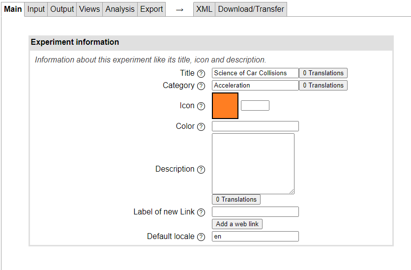
Head over to phyphox.org and click on MORE | EDITOR ((editor))
Give your project details and click on the input tab
The only input we are going to use is the accelerometer. Phyphox has a version that automatically excludes g from the readings. It does this using software magic so you do not have to:
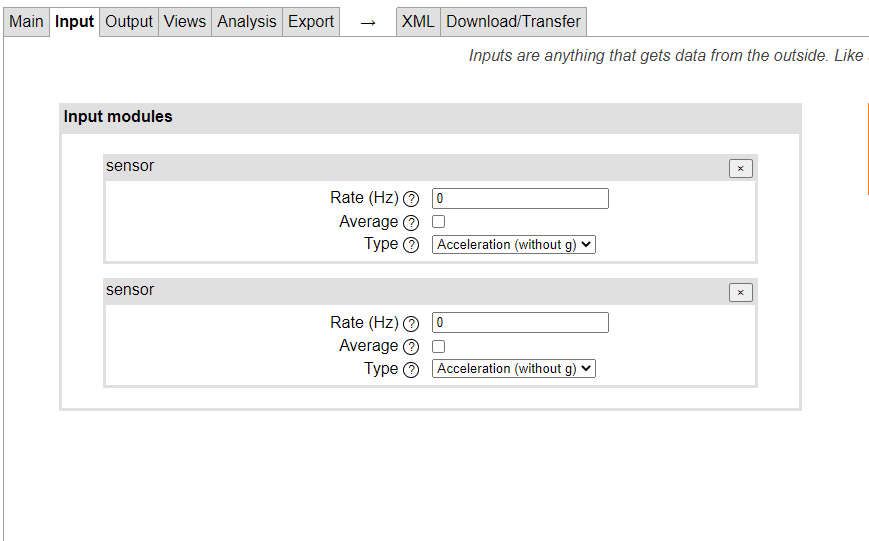
The reason we want 2 copies of it is because it just makes the following pages look easier. Technically you can do it off one sensor object.
All of the sensor objects will be physically tied to the same accelerometer, these just let us make prettier code. You will see shortly.
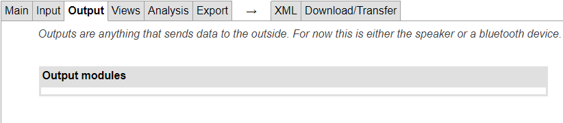
No output modules are required:
The views page is long because there are several views involved:
You want 4 graphs (total, XYZ) these will show the pretty acceleration graphs, I used these settings:
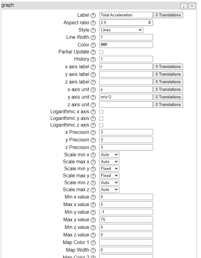
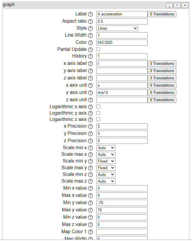
I chose to make the total A to be white and then each of the cartesian directions to be a different colour. This way the label and the charts will match.
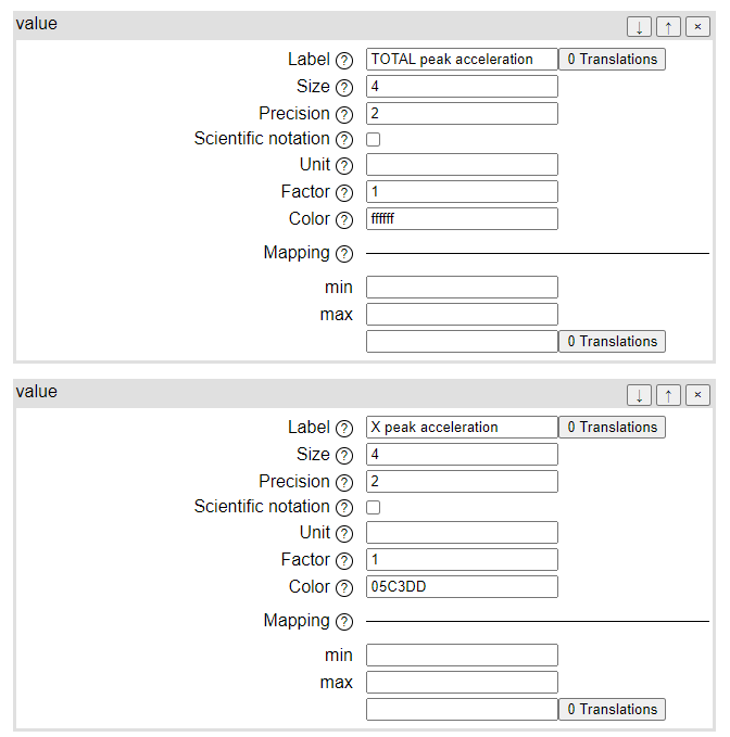
We also need a view that represents printing a raw number on the screen:
Then click on analysis:
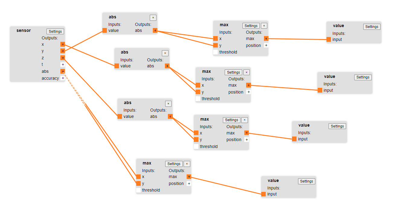
Ok it looks scary but it is not:
This section connects the sensors to the 4 graphs:
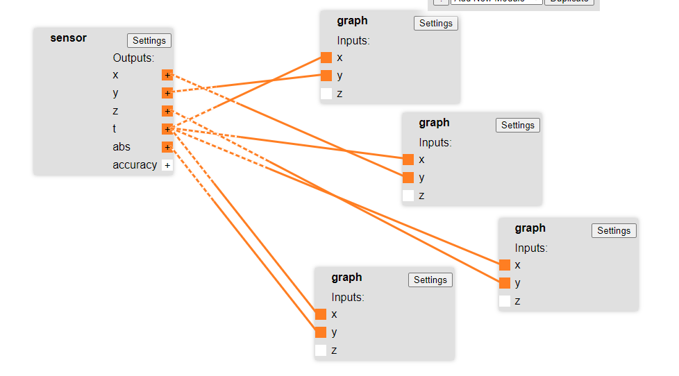
What you do, is you drag little lines that connect your sensors to each graph. Notice that the accelerometer connects XYZ to the y on a different chart and the X is always t. this is what we want, we want the charts to be graphing Acc vs time.
The next section connects the sensors to a series of functions which first take the absolute value, then record the maximum value. This way when we hit a spike on the acceleration this little box will hold it, and then feed that into our little display value boxes we made above